What is Visual Analytics?
Visual analytics is a multidisciplinary field that combines various techniques from information visualization, scientific visualization, and cognitive science to facilitate enhanced understanding and insights from complex data sets. It fundamentally emphasizes the integration of data analysis and visual representation, which plays a crucial role in decision-making processes across a multitude of disciplines.
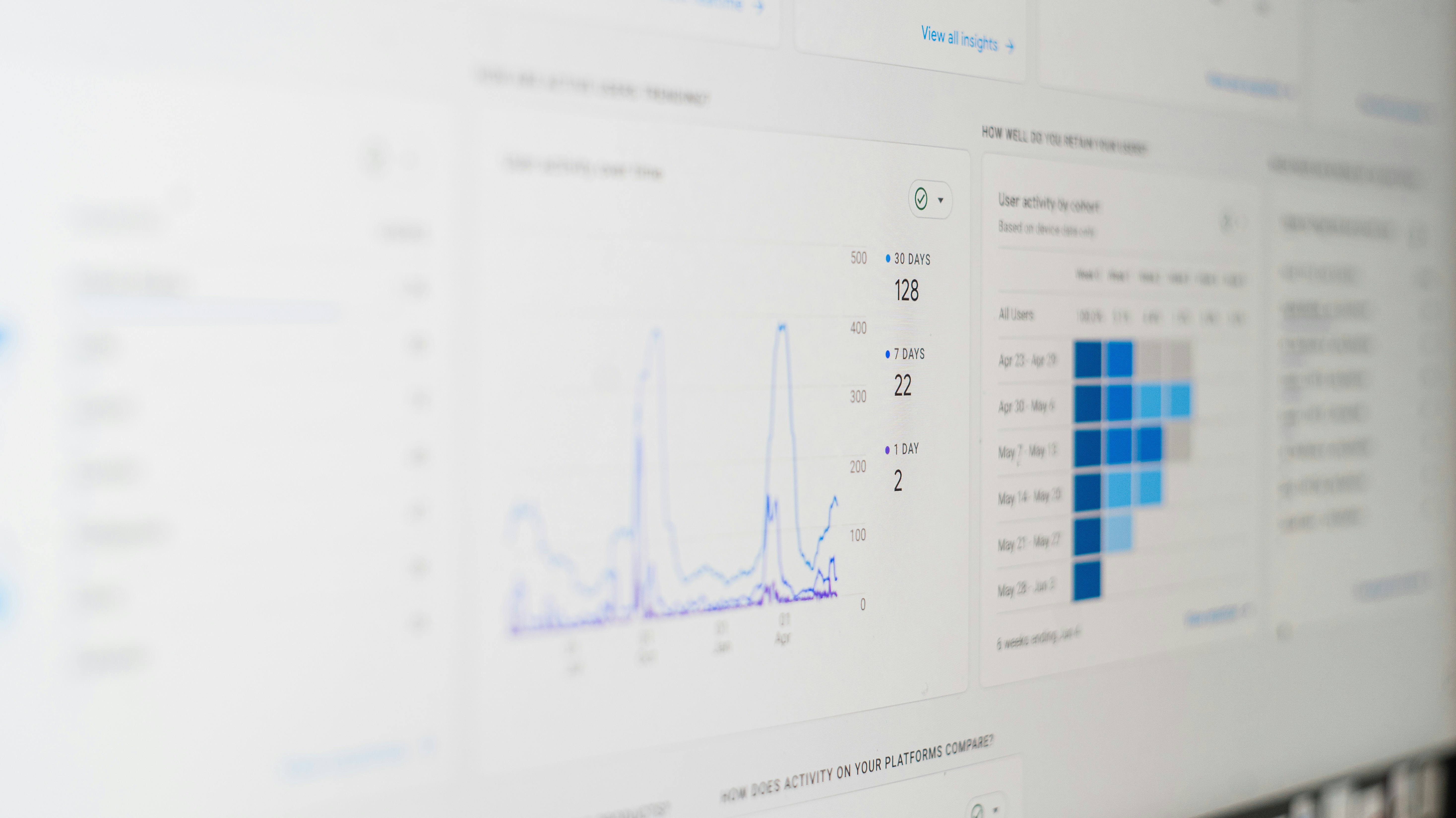
The purpose of visual analytics is to harness the power of visual representations of data to support human cognition. By transforming abstract data into visual formats such as graphs, charts, or interactive dashboards, analysts can more easily detect patterns, trends, and anomalies. This visual interaction fosters a more intuitive understanding, allowing users to explore the data dynamically and derive actionable insights with greater efficacy.
Moreover, visual analytics extends beyond mere representation of data. It incorporates advanced analytical techniques, enabling users to engage in deeper data exploration. Algorithms can uncover relationships within the data that may not be readily apparent through traditional analysis methods. By visualizing these complex relationships, stakeholders can make more informed decisions that are supported by empirical evidence and comprehensive analysis.
The integration of cognitive science principles is also a significant aspect of visual analytics. This discipline recognizes how individuals perceive and interpret visual information, thus allowing designers to create more effective and user-friendly visual representations. By tailoring visual tools to align with how users interact with and understand data, visual analytics improves the overall strategic decision-making process across various sectors including business, healthcare, and scientific research.
In conclusion, visual analytics serves as a bridge between data analysis and visual representation, leveraging multiple domains of knowledge to assist in informed decision-making. As organizations continue to generate vast amounts of data, the importance of visual analytics will be increasingly recognized in facilitating data-driven insights.
The Historical Context of Visual Analytics
The evolution of visual analytics can be traced back to two primary domains: information visualization and scientific visualization. Information visualization emerged in the late 20th century as tools and techniques were developed to present complex data in a visually comprehensible manner. The need to handle increasingly vast amounts of data drove researchers and practitioners to explore ways to assist users in understanding trends and patterns through graphical representations.
Simultaneously, scientific visualization focused on representing phenomena that were often difficult to perceive directly, such as simulations of weather patterns or molecular structures. This domain primarily catered to scientists and researchers who needed to interpret large datasets generated by simulations and experiments. The combination of these two fields set the stage for the development of visual analytics, which bridges the gap between raw data analysis and visual communications.
A significant milestone in the history of visual analytics occurred in the early 2000s when advancements in computing technology revolutionized data processing capabilities. This era saw the integration of interactive visualizations with analytical models, leading to a more dynamic exploration of datasets. Researchers like Edward Tufte and William S. Cleveland played pivotal roles during this time, advocating for clarity and efficiency in graphical presentations of data.
The rapid increase in data availability, combined with the advancement of data mining techniques, has since propelled visual analytics into a sophisticated field that continues to gain attention across various sectors, including finance, healthcare, and cybersecurity. Modern visual analytics tools are characterized by their ability to support real-time data exploration while employing complex algorithms and statistical methods. This marriage of technology and analytic capability allows users to derive actionable insights from data with greater speed and effectiveness.
Core Components of Visual Analytics
Visual analytics is a multifaceted discipline that integrates data representation, interaction techniques, and analytical reasoning to facilitate the comprehension of complex data sets. Each of these core components plays a pivotal role in transforming raw data into meaningful insights, ultimately supporting decision-making processes across various domains.
Data representation is the first core component, concerned with the visual encoding of data. This involves using graphical elements like charts, graphs, and maps to depict quantitative information in a way that is easily interpretable. Effective data representation ensures that users can quickly discern patterns and relationships within the data. For instance, bar charts can effectively illustrate comparative magnitudes, while scatter plots can reveal correlations. By selecting appropriate visual formats, analysts enhance the communication of complex data, making it more accessible to users.
The second component, interaction techniques, refers to the methods by which users engage with the visualized data. These interactions include actions such as zooming, filtering, and dragging, which allow users to explore data more intuitively. Interactive systems enable analysts to dynamically adjust parameters and drill down into specific areas of interest, fostering a deeper understanding of the data landscape. This component is crucial for user engagement, as it empowers users to tailor their analytical experience based on individual needs and preferences.
Lastly, analytical reasoning is the cognitive process that underlies the interpretation of visual analytics. It involves applying logical thought and critical thinking to assess and infer insights from visual representations. This component bridges the gap between raw data and informed decision-making, as it requires the user to synthesize information, recognize patterns, and derive conclusions based on visual cues. Together, these core components of visual analytics work synergistically, providing a robust framework for analyzing complex data, enhancing both clarity and understanding in a data-driven world.
The Role of Interactive Visual Interfaces
Interactive visual interfaces are integral to the realm of visual analytics, serving as critical tools that enhance user engagement and foster an enriching analytical experience. By providing dynamic opportunities for interaction, these interfaces empower users to manipulate data representations effortlessly, thus facilitating a more personalized approach to data exploration. As users engage with the visual aspects of data, they can discover patterns, trends, and insights that would otherwise remain obscured in static visualizations.
One of the significant benefits of these interactive interfaces is their ability to allow for real-time data exploration. Users can adjust parameters, filter datasets, and drill down into specific elements instantly, ensuring that the analysis is not only relevant but also aligns with their immediate queries. This fluid interaction creates a dialogue between the user and the data, allowing for a more comprehensive understanding, as opposed to interpreting pre-generated reports. Furthermore, as users interact with these interfaces, they can experiment with various visualization methods to determine which best elucidates the data narrative they seek to uncover.
In addition to enhancing engagement and real-time analysis, interactive visual interfaces also facilitate deeper analytical reasoning. The capability to visualize data in multiple ways enables users to compare and contrast different datasets, ultimately aiding in drawing more accurate conclusions. As users analyze complex information through these interfaces, their cognitive load is significantly reduced, enabling clearer thinking and better decision-making. Overall, the role of interactive visual interfaces in visual analytics cannot be overstated; they enrich the user’s experience and make data more accessible and understandable. Through such advancements, the intersection of science and technology in visual analytics continues to evolve, paving the way for more effective data storytelling and insight generation.
Applications of Visual Analytics Across Disciplines
Visual analytics has become an essential tool across various fields, providing insights that drive decision-making processes and enhance data comprehension. In healthcare, practitioners utilize visual analytics to interpret patient data, track health trends, and identify potential outbreaks. By employing interactive visualizations, medical professionals can easily highlight correlations and anomalies within vast datasets, significantly improving patient outcomes and patient care efficiency.
In the finance sector, visual analytics plays a pivotal role in risk management, fraud detection, and investment analysis. Financial analysts leverage visual tools to map trends and patterns in market behavior, enabling them to make informed investment decisions. By visually presenting data, such as stock performance over time, organizations can quickly identify potential risks and opportunities, leading to better financial forecasts and strategic planning.
The security domain also benefits from visual analytics, where it aids in threat detection and response. By analyzing network traffic and correlating disparate data sources, security analysts can visualize potential vulnerabilities and attack patterns. This approach not only enhances understanding but also facilitates rapid responses to incidents, ultimately improving national and organizational security measures.
Marketing is yet another discipline where visual analytics has gained traction. Marketers use visual tools to analyze consumer behavior and market trends, allowing for more precise targeting of campaigns. Through visual representations of data, such as demographics and customer engagement levels, businesses can adapt their strategies to meet the evolving needs of their audiences effectively.
Overall, the applications of visual analytics extend across various disciplines, with each sector harnessing its power to dissect complex problems and derive actionable insights. This multifaceted approach not only enhances understanding but also fosters improved decision-making processes, resulting in tangible outcomes across healthcare, finance, security, and marketing.
Benefits of Visual Analytics
Visual analytics represents a significant advancement over traditional analytical methods, offering numerous advantages that enhance data understanding, speed up decision-making processes, and improve problem-solving capabilities. One of the primary benefits of visual analytics is its ability to transform complex data sets into intuitive visual representations. This transformation allows users to quickly grasp underlying trends, patterns, and relationships within the data, which can be challenging to identify with standard numerical data alone. As a result, stakeholders can make informed decisions more rapidly and effectively.
Another notable advantage of visual analytics is the ease with which it accommodates large volumes of data. In traditional analytical methods, the sheer volume of data often leads to information overload, where critical insights may become obscured. However, visual analytics simplifies this process by distilling extensive data into meaningful visuals, making it easier for users to detect anomalies, correlations, and trends without wading through extensive datasets. This ability to visualize vast amounts of information leads to more insightful conclusions and facilitates proactive decision-making.
Enhanced collaboration is also a key benefit of visual analytics. By presenting data visually, organizations can foster better communication among team members and stakeholders. Visualizations serve as common points of reference, ensuring that everyone involved in the decision-making process has a clear understanding of the data at hand. This shared comprehension encourages collaborative efforts in problem-solving, as teams can draw on diverse perspectives and expertise while interpreting the visual metrics being analyzed.
Incorporating visual analytics into organizational practices ultimately leads to improved outcomes. By transforming complex data into accessible formats, teams can respond to challenges more swiftly and efficiently, turning insights into action. The multifaceted benefits of visual analytics not only bolster individual and team performance but also contribute to the overall strategic goals of the organization.
Challenges and Limitations of Visual Analytics
Visual analytics offers profound advantages in interpreting and presenting data, yet it is not without its challenges and limitations. One significant challenge faced in this field is data quality. Inaccuracies, inconsistencies, and incompleteness in the underlying data can lead to misleading visual representations, thereby affecting decision-making processes. Ensuring data integrity is crucial because the effectiveness of visual analytics hinges on the reliability of the data being analyzed.
Another challenge is cognitive overload. When visual analytics tools present excessive information without proper organization, users may struggle to derive actionable insights. Cognitive overload occurs when the volume of data visualizations exceeds a user’s capacity to process the information effectively. This limitation necessitates balancing the depth of data presentation with user comprehension to enhance analysis and reduce confusion.
Moreover, the need for user training cannot be overlooked. Users may require specific skills and knowledge to navigate visual analytics tools successfully. As technology evolves, continuous education is essential to keep users updated about new features, capabilities, and best practices in utilizing these tools. Inadequate training can result in suboptimal usage of visual analytics platforms, further impeding their effectiveness.
Additionally, the visualization techniques employed must reflect the appropriate context and audience. A mismatch in visual presentation can mislead users and obscure critical insights. Consequently, visual analytics professionals must remain vigilant about the design principles guiding their visual representations.
Addressing these challenges is imperative for organizations aiming to maximize the efficacy of visual analytics. By focusing on data quality, mindful visualization practices, and robust user training programs, organizations can enhance their analytical capabilities and empower informed decision-making.
Future Trends in Visual Analytics Technology
As we delve into the future of visual analytics technology, it becomes evident that significant advancements are on the horizon, particularly in the realms of machine learning and artificial intelligence. These fields are not only reshaping the landscape of data analysis but are also enhancing how organizations can interact with and interpret vast datasets.
Machine learning algorithms are becoming increasingly sophisticated, enabling more accurate predictions and classifications. This advancement leads to improved analytical models that can process data in real time, uncovering insights that were previously obscured in traditional analytical frameworks. As agencies and corporations continue to rely on data-driven decisions, the demand for intuitive and responsive visual analytics tools will grow, fueling the evolution of machine learning applications in this space.
Moreover, artificial intelligence is expected to play a pivotal role in visual analytics by providing automated insights and recommendations based on complex data patterns. AI-powered systems can analyze user interactions and adapt visual representation techniques accordingly, ensuring that users can grasp key information quickly and effectively. The integration of natural language processing (NLP) within visual analytics platforms will further enhance accessibility, allowing users to query data using everyday language and receive visual feedback almost instantaneously.
Additionally, the rise of immersive technologies, such as augmented reality (AR) and virtual reality (VR), will introduce unprecedented ways to experience visual analytics. By creating immersive environments where individuals can interact with data visualizations, organizations will be able to uncover new patterns and correlations that were difficult to perceive in two-dimensional formats. This innovative approach will foster an interactive exploration of data, leading to deeper insights and informed decision-making.
In summary, the future of visual analytics technology promises to be dynamic and transformative, driven by advancements in machine learning, artificial intelligence, and immersive technologies. As these trends emerge, they will continue to shape the way we visualize and derive meaning from data in an increasingly complex world.
Getting Started with Visual Analytics Tools
Embarking on a journey into the realm of visual analytics can seem daunting, especially for organizations or individuals who are newly introduced to this dynamic field. However, with the right tools and resources, one can effectively navigate the complexities of data visualization and analysis. At the core of this process lies the selection of appropriate visual analytics tools, which serve as the foundation for transforming raw data into actionable insights.
Begin by familiarizing yourself with popular visual analytics tools such as Tableau, Power BI, and QlikView. These platforms are renowned for their user-friendly interfaces and robust functionalities, making them suitable for newcomers. Tableau, for instance, offers a free public version that facilitates learning and experimentation, while Microsoft Power BI provides a rich array of features for data exploration and visualization. Additionally, QlikView emphasizes associative data modeling, enabling users to uncover hidden insights.
In addition to selecting tools, it is advisable to engage with various online resources to elevate your understanding. Websites like Coursera, Udemy, and edX host numerous courses focused on visual analytics, guiding users through practical exercises and real-world applications. Moreover, participating in community forums or local meetups can provide invaluable opportunities for networking and knowledge sharing.
When deploying visual analytics in your organization, consider best practices that enhance the effectiveness of your visualizations. Prioritize clarity by avoiding excessive complexity in your visual representations, ensuring that your audience can easily interpret the data. Use consistent color schemes and design principles, which helps convey information more powerfully and effectively. Lastly, always remember that the ultimate objective of visual analytics is to support strategic decision-making through insightful data interpretations.